
Correlation – How To Put Strategies Together
If you want to prosper as a trader you need to trade many strategies.
How many?
That is hard to tell but preferably you’d want to have a few for each asset class. Also, you might want to develop strategies with different types of strategies, for example, both mean reversion and trend-following.
Why should you have different strategies?
Because you want to avoid correlation among your strategies. You don’t want to risk strategies that all lose money at the same time! Understanding the correlation among your trading strategies is very important! We would even go on to say it’s one of the most underrated aspects of trading.
To get a better understanding of this, let’s start by looking at correlation:
What is correlation?
Correlation in trading means how your trading strategies perform together. The strategies should not produce negative results at the same time or during the same time frame, but rather make profits and losses independently from one another. This is one of the most important aspects of trading, but also one of the most difficult.
Correlation in trading is a mathematical term that measures the relationship between two variables or datasets.
For example, the height of children tends to correlate to the height of the parents.
Likewise, your income mostly correlates to the amount of work you put in. It’s a statistical measure that shows how two variables are related but without considering causation.
The degree of the correlation is expressed by the correlation coefficient, which ranges from -1 to +1. In most statistical software, the coefficient is expressed as r. The significance of the correlation is expressed as p. The more observations you make, the more powerful your correlation is.
Something that is perfectly correlated has a correlation of 1. When the two variables correlate inversely, ie. they move opposite one another, the correlation coefficient is -1. A zero correlation coefficient means that the asset prices are uncorrelated. Most stocks are highly correlated in the stock market, meaning they move up and down in tandem.
Unfortunately, correlation is hard to predict because it’s not a static number but is constantly changing. Moreover, during panics and volatility, most asset classes start moving in tandem. Because something has had a low correlation in the past, doesn’t mean it will continue doing so in the future!
To make sure you better understand correlation let’s look at some relationships:
Examples of “obvious” trading correlations:
Perhaps some examples better illustrate what is meant by correlation in trading:
- The price of oil and the Norwegian krona (a low oil price is bad)
- The price of oil and the Canadian dollar (a low oil price is bad)
- The price of commodities and the price of the Australian dollar (Australia is a commodity producer)
- Airline stocks and the price of oil
- The price of gold and the increase of the US dollar (USD) money supply
- Better than expected earnings result in increased share prices
- Low PE readings and later higher share price (inverse relationship)
- Rising interest rates and share prices (inverse relationship)
- Inventory increases and future sales (inverse relationship)
- When the price of goods drop, demand increases
- Warm temperatures increase the demand for ice cream
We hope you get the idea.
Uncorrelated asset classes
Let’s look at some different uncorrelated asset classes. The table below includes trend-following funds.
Why do we add a trend-following fund?
We add a trend-following fund because they employ strategies that can be profitable in both rising and falling markets. Moreover, trend-following strategies have a non–linear pay–off to their underlying market universe. Trend following often performs very well when stocks are having a tough time, thus it provides diversification and non-correlation.
This is exactly what you are looking for in terms of diversification! As long as you have large moves either up or down you perform well with any trend-following strategies.
To give you a better understanding of the annual returns of trend-following and commodity hedge funds, we have assembled this table of annual returns for you for different asset classes:
| Year | Paul Mulvaney Trend |
Eurekahedge | Barclay CTA Index | Lynx | S&P 500 |
| 2000 | 24.51 | 23.2 | 7.86 | 13.97 | -10.14 |
| 2001 | 6.69 | 16.56 | 0.84 | 15.33 | -13.04 |
| 2002 | 19.37 | 23.07 | 12.36 | 18.68 | -23.37 |
| 2003 | 29.28 | 25.7 | 8.69 | 31.58 | 26.38 |
| 2004 | -0.1 | 8.85 | 3.3 | 12.61 | 8.99 |
| 2005 | 32.34 | 6.24 | 1.71 | 8.31 | 3 |
| 2006 | 21.94 | 10.16 | 3.54 | 9 | 13.62 |
| 2007 | -23.14 | 20.64 | 7.64 | 15.3 | 3.53 |
| 2008 | 108.87 | 29.8 | 14.09 | 38.24 | -38.49 |
| 2009 | -5.9 | 5.4 | -0.1 | -9.43 | 23.45 |
| 2010 | 34.9 | 10.91 | 7.05 | 19.18 | 12.78 |
| 2011 | -5.26 | 1 | -3.09 | -2.24 | 0 |
| 2012 | -33.72 | -1.89 | -1.7 | -6.73 | 13.41 |
| 2013 | 43.12 | 1.19 | -1.42 | 11.11 | 29.6 |
| 2014 | 67.36 | 12.91 | 7.61 | 27.03 | 11.39 |
| 2015 | -0.77 | -1.82 | -1.5 | -8.73 | -0.73 |
| 2016 | -1.82 | -0.76 | -1.23 | -3.29 | 9.54 |
| 2017 | 1.57 | 0.13 | 0.7 | -4.05 | 19.42 |
| 2018 | -4.33 | -6.23 | -3.17 | 0.35 | -6.24 |
| 2019 | -21.28 | 6.74 | 5.17 | 18.36 | 28.88 |
| 2020 | 18.53 | 11.29 | 5.43 | 7.78 | 16.26 |
| 2021 | 32.93 | 5.92 | 5.04 | 1.29 | 26.89 |
| 2022 (1H) | 87.8 | 18.75 | 8.1 | 28.78 | -18.4 |
The second column is the hedge fund of Paul Mulvaney who has one of the best track records there is in the commodity business. The third column is an index made by Eurekahedge that tracks the performance of trend-following funds. The fourth column is Barclay’s CTA Index, and the fifth column is the Swedish hedge fund Lynx (a systematic trend following fund).
What is the correlation like? All funds have a correlation between -0.3 to -0.5 to S&P 500. Perfect!
What is most interesting with this table is to look at the performance in the alternative funds when the S&P 500 performs poorly, especially in 2000-2003 and 2008. For example, look at Lynx in 2008 when it was up 38.24% while S&P 500 was down 38%! This pattern is repeated so far in 2022 (which has been a poor year for stocks thus far).
A backtest of uncorrelated assets
Let’s make a simple backtest as an example to show you the power of mixing different types of strategies and asset classes.
Below we show how adding uncorrelated assets reduce volatility in your stock portfolio and might also increase the total returns.
Let’s assume you buy the S&P 500 in January 2000. However, you also add the Swedish trend-following fund called Lynx (look at its performance in the table above). We select Lynx because we indirectly have units in the fund ourselves and we have Lynx’s data available at our disposal. Keep in mind that Lynx has performed well, and we might be liable to survivorship bias in our selection (see more about this later in the course).
How much should you allocate to each fund? In this example, we allocate 75% to S&P 500 and 25%. We start our backtest in 2000 and rebalanced at the start of every year thereafter (this is the USD returns of Lynx). The accumulated returns would have been like this:
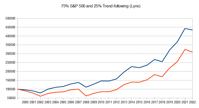 The red line is S&P 500 and the blue line is our diversified portfolio. CAGR is 7.25% for the combined portfolio while it’s only 5.6% for S&P 500 (dividend reinvested is not included). This is a huge improvement compared to only owning stocks. Drawdowns are also substantially lower.
We might argue we are lucky with our pick with Lynx. What if we only managed the return of the Barclays CTA Index? That index had an annual return of only 3.7% over the period while Lynx had 9.9%.
But even if we allocate 25% to Barclays CTA Index and rebalance every year, we would get the same return as holding the S&P500 but with lower drawdowns (the red line is S&P 500, the blue line our portfolio):
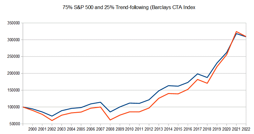
We get the same return with less volatility! The bottoms are higher and your start compounding at a higher level when the dust settles. This is why you want to mitigate volatility!
Many argue volatility doesn’t matter, but we disagree. Due to behavioral mistakes in trading, you risk selling at the worst time the more volatility you have in your portfolio. All empirical evidence points toward that.
Adding similar and correlated trading strategies
Let’s look at how it should NOT be done.
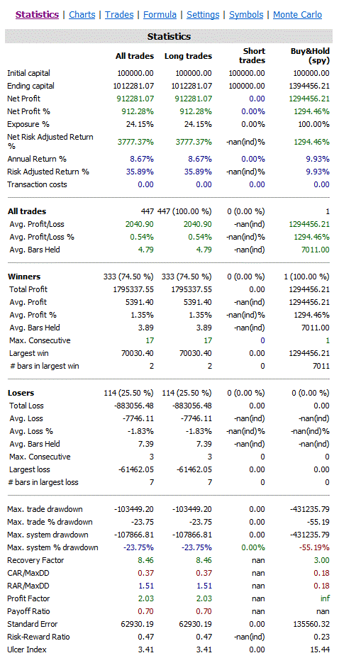
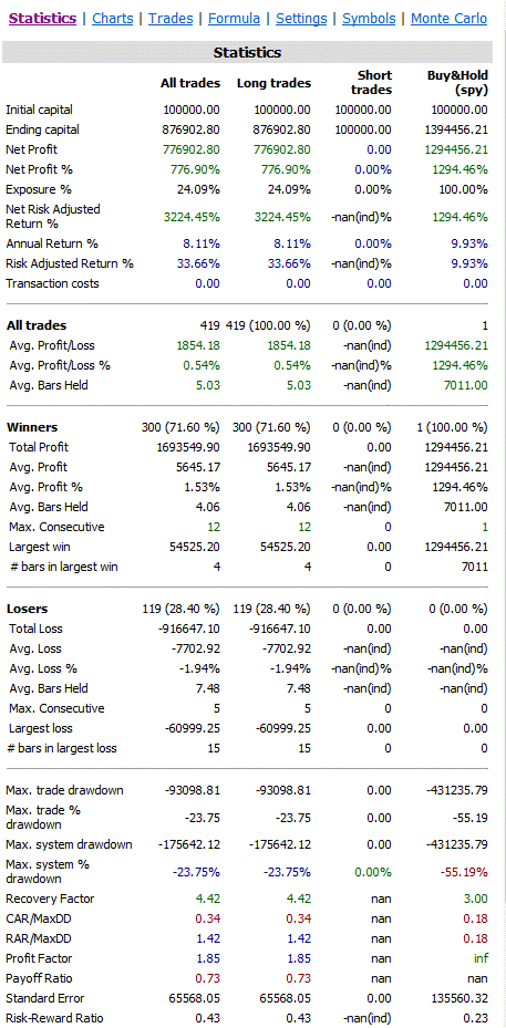
Let’s assume you have an existing portfolio of trading strategies with this equity curve:
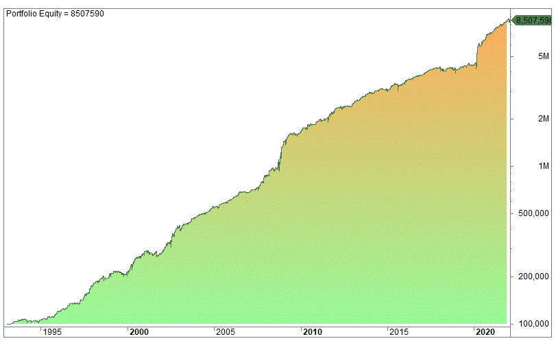
The average gain per trade is 0.3% over more than 1 500 trades. These are several overnight trading strategies.
Then you come across a promising mean-reverting strategy that has the following equity curve (and you consider adding it to the other strategies above):
 The average gain is 0.33% and the win rate is 65%. It’s a pretty good strategy, we would say.
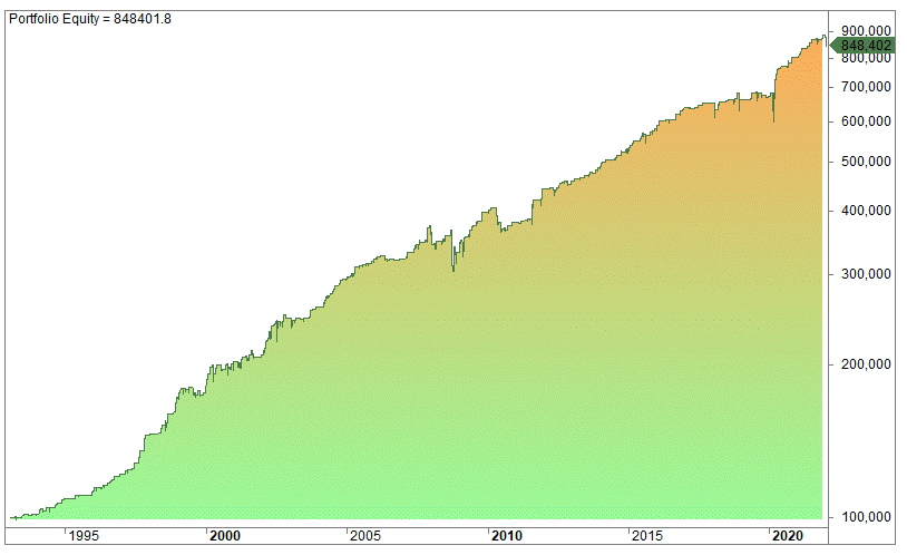
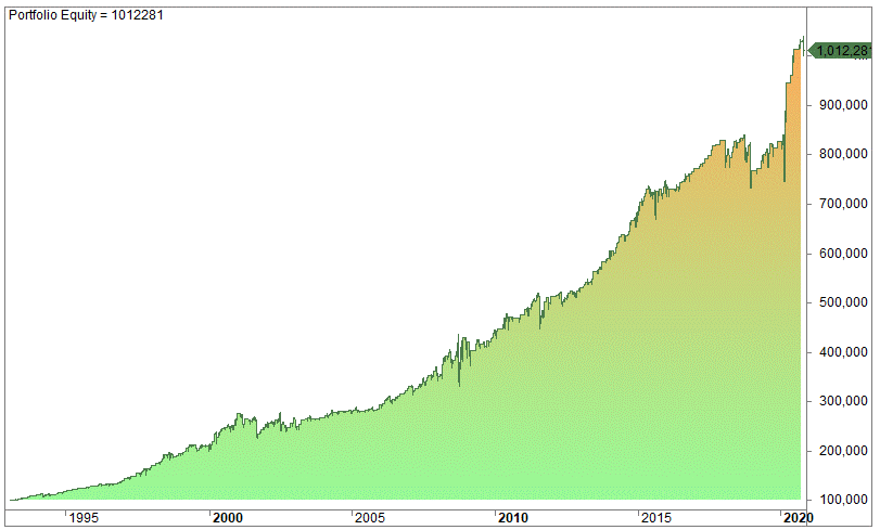
What happens when you add the extra strategy together with the other strategies you had from before? Something surprising happens – the trading and performance metrics deteriorate:
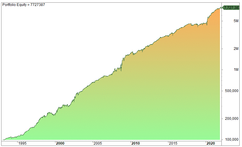 When you add this seemingly good strategy, the overall performance drops (overall equity drops from 8,5 million to 7.27 million)! The overall returns drop and drawdown increases.
Why?
This happens because you add a similar strategy that is highly correlated with your existing strategies. Your trades overlap, and you mainly add the losers from the new strategy.
This is why you can never add trading strategies without looking at your strategies as a portfolio of strategies.
Yet another correlation example
Let’s make an example of two very simple strategies and look at how they perform together.
In plain English the strategy is like this:
- Buy when the two-day RSI indicator is below 15. Read here for how the RSI indicator works.
- Enter at the close.
- Sell when today’s close is higher than yesterday’s high.
- Exit on the close.
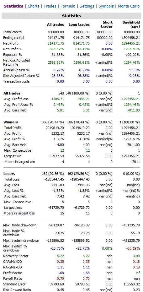
The strategy performs like this on the S&P 500 (100 000 compounded from 1993 until November 2020):
 And the equity curve looks like this:
 Not bad for being invested 24% of the time!
But let’s look at another strategy that is somewhat similar in nature, ie. mean-reverting:
The strategy goes long when today’s close has dropped more from yesterday’s close than the 100-day average difference of the high minus the low. The strategy is of course very similar to the RSI strategy and returns a pretty similar result:
But how do these two strategies perform together? Let’s assume you want to trade both strategies, but only have one position in SPY at all times. Hence, you only trade when you have no position, you don’t enter an additional position when you are already long. Combined the strategy is like this:
Combining the two strategies we get this result:
All parameters deteriorate – the average per trade and the profit factor both decline while the time spent in the market increases from 24% to 31%.
Obviously, the strategies are very similar in nature and have a lot of overlapping trades.
But that is the point of showing these two strategies: you need to have strategies that are different. You can’t add strategies that are reasonably similar, you need to complement the portfolio.
Uncorrelated Assets And Strategies – What Are The Benefits And Advantages
This lesson has hopefully shown you the benefits and advantages of uncorrelated assets and strategies.
Total returns of an asset are not necessarily the main criteria to look for when you want to add assets or strategies to your portfolio. Even assets or strategies that have lower total returns can be much more beneficial than including assets with higher returns. The simple reason is due to non-correlation. This is why the composition of assets and strategies is not an easy task.