Linear Vs. Logarithmic Charts And Scale – What Is Log Scale Chart (What Is The Difference?)
Linear vs logarithmic charts and scale is important to understand because the difference between linear and logarithmic charts might be huge – the bigger the scale the more it matters. The difference between a linear chart and a log scale grows significant as the time frame expands.
In this article, we explain what a log scale chart is. We look at linear vs. logarithmic charts and scales, what is the difference, and why it’s best and important (and correct) to use a logarithmic scale and not a linear one. A linear chart shows the points change, while a logarithmic chart shows the percentage change. Thus, they differ more the bigger the movement is.
What is a linear chart?
A linear chart shows the same distance between the values on the y-axis. For example, a rise from 50 to 51 shows the same distance as from 100 to 101, even though the first one rises 2% and the latter rises only 1%.
The scale below is linear and the difference between 120 to 140 is the same as 320 to 340:

What is a log scale chart?
A logarithmic scale, often called a log scale, shows the percentage (relative) change. If an asset rises from 50 to 60, a rise of 20%, it’s presented in the same way as a change from 10 000 to 12 000 (also a 20% rise).
If we change the linear scale from the pic above to log scale (logarithmic scale), the scale changes significantly:

The distance between the lower numbers is higher than the upper numbers.
Why does it change? Because the log scale shows the percentage changes (relative changes) – not absolute changes. A rise from 120 to 140 is much bigger relatively than a rise from 320 to 340, even though both rise 20 points.
What is the difference between a linear and logarithmic chart? What is best?
We can conclude that a linear chart shows the absolute values/changes, while a logarithmic scale shows the relative changes.
What is best – linear or log scale?
Obviously, a log scale is the correct one to use instead of a linear chart. The importance of using logarithmic scales grows as the time frame gets bigger.
What is the benefit of logarithmic charting?
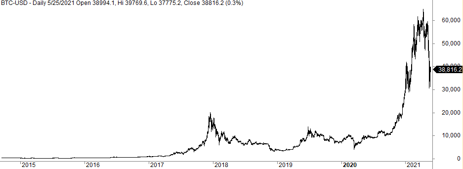
The main benefit is that you get a correct visualization of percentage moves, not absolute moves. For example, if you show a linear chart of bitcoin from 2015 until 2021, the chart gives an improper view of the “real” changes in the asset.
A picture describes the differences much better:
A visualization of linear vs. logarithmic charting
Let’s look at the difference between linear and logarithmic charts. The first chart is bitcoin (in USD) using a linear chart: