
Profit Factor In Trading(What It Is A Good Profit Factor?
We explain what a good profit factor is in trading (profit factor trading). How do you evaluate a trading strategy? In hindsight, it’s easy to judge a strategy by the result – the CAGR or the annual return. However, the profit factor is a handy tool to quantify the quality of the return and the CAGR. However, a good strategy can’t be judged solely on the return or the CAGR.
In this article, we look at the profit factor and explain what it is. We show you how it’s calculated and how you can interpret it. Moreover, we establish what a good profit factor in trading is: a good profit factor in trading has a value of more than 1.75 but preferably not above 4 either.
In trading, you don’t want to become a victim of resulting, as explained by Annie Duke in her brilliant book Thinking In Bets. A good decision can lead to a bad outcome, and a bad decision can lead to a good result. When looking at just one decision, the quality of the decision is, of course, not necessarily linked to the outcome. However, the correlation between these two is high in the long run.
How do you evaluate a trading strategy?
Traders use the equity curve to judge the performance of a trading strategy.
What is an equity curve?
The equity curve is a graphical (or visual) plot of your trading account over time. For example, if you backtest one trading strategy you might start with a hypothetical 100 000 at the start. As you generate buy and sell signals, you invest 100% of your equity per signal.
Thus, over time, the equity line shows your accumulated or compounded account over time as it goes up or down. Hopefully more up than down!
Below is an example of an equity curve for a trading strategy in Amibroker:
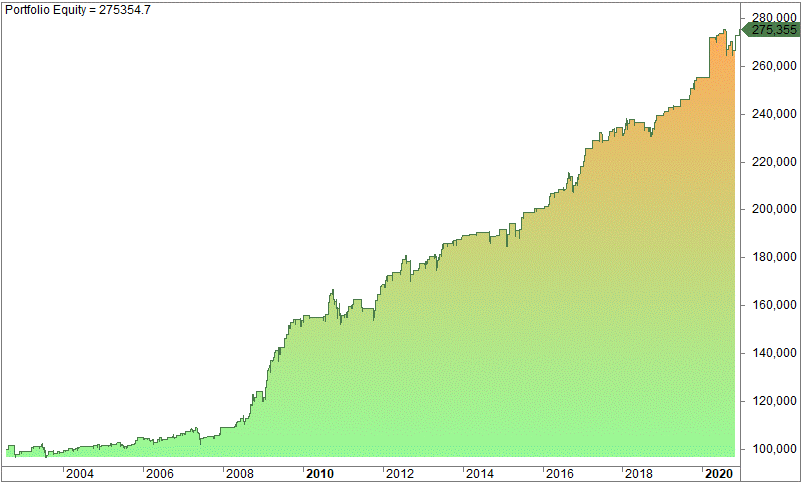
The equity curve started at 100 000 in 2002 and ended at 275 355 in 2021. The equity curve slopes upward from left to right, and the strategy is making money, but not a significant amount considering the time of nearly 20 years.
The chart below is a real-life example of the equity curve of Brummer & Partners Multi-Strategy Fund:
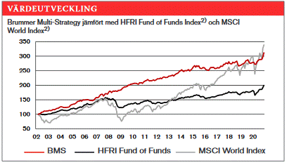
The red line is the performance of the strategy, while the grey line is the Swedish Total Return Index. Both ended up at close to the same level, but as you can see, the ride has been much less bumpy for the owners of the Brummer funds.
This is exactly what you look for in a strategy! You want it to be smooth.
The more smoothly the equity chart rises from the left to the right, the better the strategy, as long as it’s not curve-fitted. By looking visually at the equity chart, you get a pretty good estimation if the strategy is worthwhile on its own or in need of some additional variable(s).
If the equity line goes like a straight line, obviously, the strategy must be pretty good. In these circumstances, you don’t need much of a mathematical confirmation if the strategy is good (or not). However, some traders focus on the