Renko Trading Strategy 2024 – Renko Chart Backtest, timeframe, setup, and Example
The Renko trading strategy is a type of charting that is built to show a specified range of price movements rather than time-based price movements like most chart types. It looks like a series of bricks, with each block positioned at a 45-degree angle (up or down) to the prior brick. An up brick is typically colored white or green, while a down brick is typically colored black or red. The chart is best used for trend-following, as it filters out small price movements so that traders can focus on the larger trend.
There are different kinds of price charts available to traders. Most are structured to show price movements with reference to time, but some are created to show a specified range of price movements. The Renko chart belongs to the latter. Wondering what the Renko trading strategy is?
In this post, we take a look at the Renko charting method and strategy. We would like to make a Renko trading strategy backtest, but because of the look-ahead bias, you have to be careful. More about that at the end of the article.
What is the Renko chart?
The Renko chart is a type of trading chart that is built to show a specified range of price movements rather than time-based price movements like most chart types. It filters out small price movements so that traders can focus on the larger trend. The chart looks like a series of bricks, with each block positioned at a 45-degree angle (up or down) to the prior brick. An up brick is typically colored white or green, while a down brick is typically colored black or red.
For a brick to be created, the price must move a specified amount in one direction. A brick can be any price size, such as $0.5, $2, $5, and so on. This is called the box size and can also be based on the Average True Range (ATR). If the box size is not reached, a new brick would not be printed. Consecutive bricks do not occur beside each other; thus, when the price changes direction, a new brick is not printed in the new direction until the price moves twice the box size.
Since all movements that are smaller than the box size are filtered out, Renko charts smooth price movements to help traders to more clearly see the trend. When the price is rising, white or green bricks are printed, and when the price is falling, red or black bricks are printed, depending on the colors chosen in the settings.
This makes it easy to spot the current direction in which the price moves and makes trends clearer. When correctly, Renko charts can help to eliminate confusion based on price direction and may improve a trend trading strategy.
Although Renko chart strategies have a time axis, the bricks are not printed based on time intervals. Some bricks may take longer to form than others, depending on how long it takes the price to move the required box size. Renko charts typically use only closing prices of the chart timeframe on which it is set to calculate the price movement. So, if a daily timeframe, then daily closing prices will be used to construct the bricks.
Where does the Renko chart come from? (History)
As with most interesting chart types, such as the candlestick and Kagi charts, the Renko chart has its origin in Japan.
Since the chart looks like a series of bricks, it is thought to be named after the Japanese word “renga”, which is translated as “brick”. The Renko chart is built using price movement rather than price and standardized time intervals like most charts.
How the Renko chart works
A Renko chart consists of bricks representing a specified range of price movement, often known as the box size. The trader determines the brick size for the chart, which then determines when a new brick will form. The bricks are arranged up or down from the previous brick at a 45-degree angle — no two bricks can lie beside each other. So, if the price reverses, it must move double the box size before a new brick is printed in the new direction.
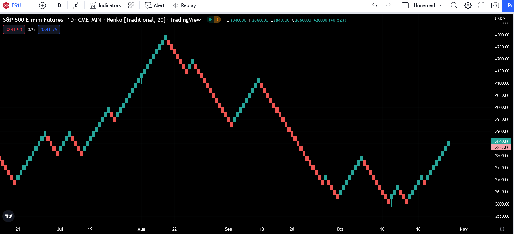
For example, for a market like the S&P 500 e-mini whose price movement is measured in points, if a box size of 20 is chosen, it means that the price needs to move 20 points from the closing price of the preceding brick in order to print a new brick in the current direction. Only moves of 20 points are highlighted by the bricks. Moves smaller than 20 points (from the preceding brick) will not form new bricks.
Also, given that bricks can’t form beside each other, the price needs to move 40 points to form a brick in the opposite direction. Anything less than that would not print a new brick in that direction.
As we stated earlier, Renko charts filter out minor price movements to make it easier for traders to see the important trends. But while this makes trends much easier to spot, some price information, such as the high and low prices, is lost in the bricks.
Usually, Renko charts do not show wicks, but TradingView programmed its Renko chart to use a wick to represent situations of attempted reversals where the price crossed the previous brick but wasn’t big enough to print a new brick in that direction before reversing to continue in the current direction. See the S&P 500 index e-mini chart below:
How to use the Renko chart
If you want to use the rencko chart on a stock chart, the first step is to open the stock chart on your trading platform — TradingView, for example. Then you select the Renko chart from the chart dropdown.
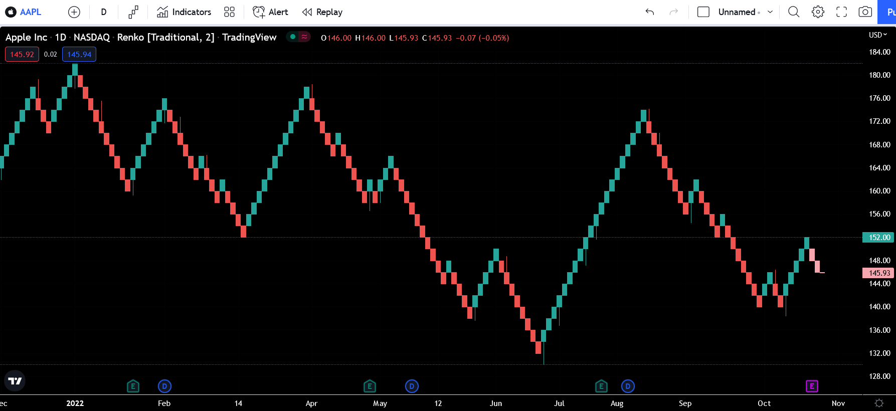
Next, select your preferred box size, which represents the amount of price movement that would print a brick. For example, let’s say you opened the Apple Inc (AAPL) chart, which typically has an average daily range of $4; you can choose a $2 box size. The Renko chart is then plotted on the chart. For every $2 move the price makes in the current direction, a brick is formed. But if the price moves in the opposite direction, it has to make a $4 move for a new brick to be printed in that direction. See the AAPL chart below: